Bomond
About:An online store with a complete and unique range of products for Ukraine. Bomond stores are located in almost every major city in Ukraine.
Services:web design, development, SEO optimization.
Goals:Develop the company's online store and strengthen its online presence in the market. Create a convenient and intuitive interface for a sophisticated and demanding audience.
Result:We received a well-thought-out product with a light and bright interface that emphasizes the uniqueness of the brand without distracting the user from making a purchase.
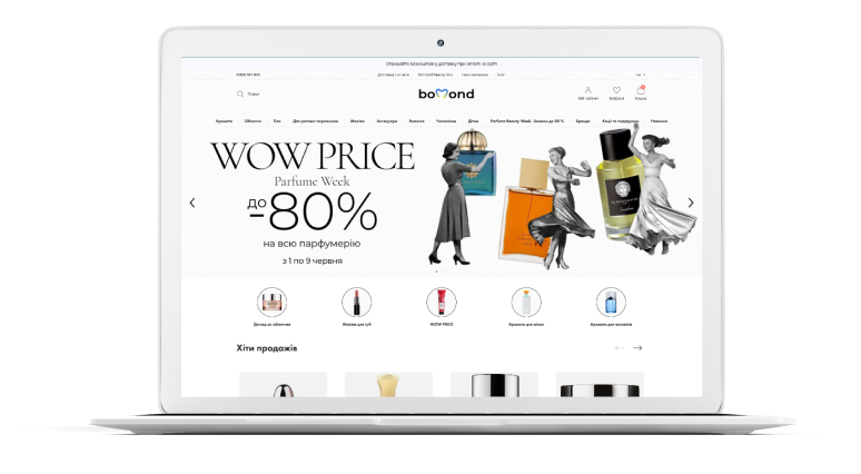
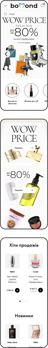
Main Page
Modern, laconic and functional design
First Screen
- Fixed the navigation menu at the top of the page.
- Developed a hierarchical structure for the services catalog.
- Placed the catalog in horizontal order, structured subcategories.
A clear company description immediately gives an understanding of who you are and what you do. This builds trust, keeps users on the site and leads to action — viewing services or submitting a request.
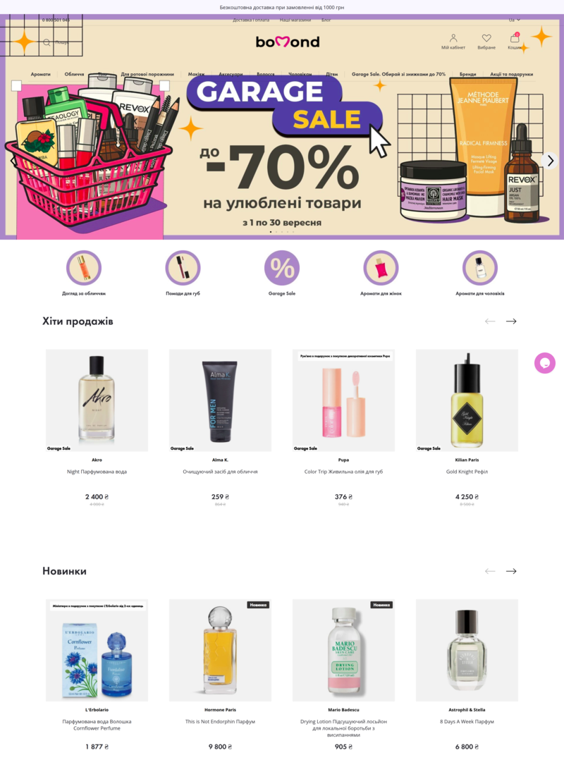
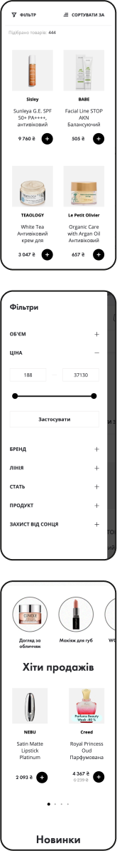
Popular Products Block
Helps visitors choose popular items faster, increasing trust in the site and stimulating purchases.
New Arrivals Block
attracts attention to new arrivals and demonstrates the relevance of the assortment.
Unique Selling Proposition (USP)
Clearly conveys the company's main advantages, helps attract customers and increase conversion.
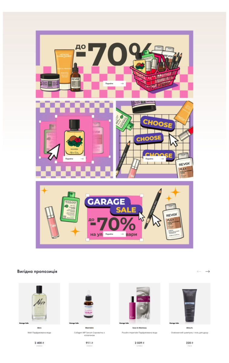
Promotions (banner)
informs about special offers and discounts, encouraging users to take targeted actions.
Profitable Offers
highlights products with the best purchase conditions, stimulating interest and conversion.
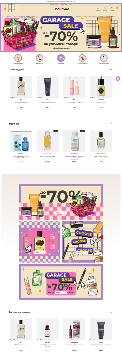
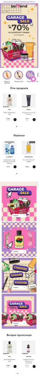
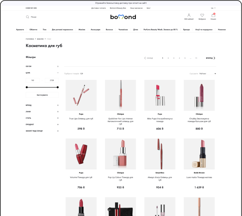
The site is designed like a magazine, which emphasizes the brand style and will resemble a beautiful showcase with unobtrusively presented prices.
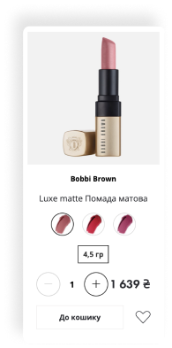
- Focused user attention on the product and its configurations
- Simplified product selection process with convenient filters
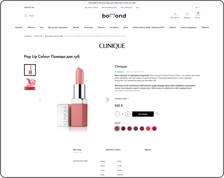
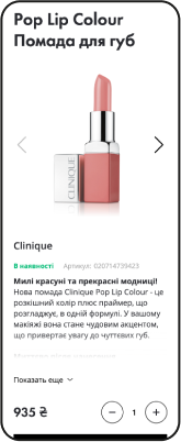
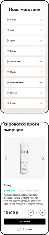
A page where it's important for the buyer to find answers to all their questions about the product, its characteristics, payment terms, returns, delivery, etc.
- Focused user attention on the product and its configurations
- Simplified product selection process with convenient filters
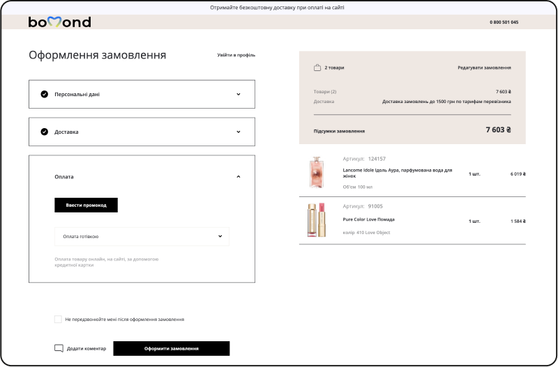
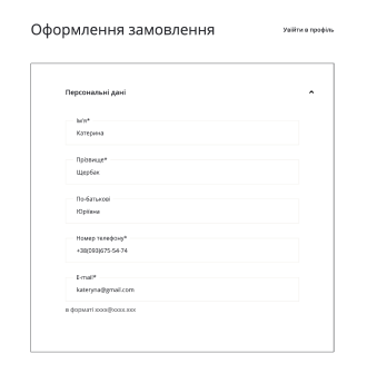
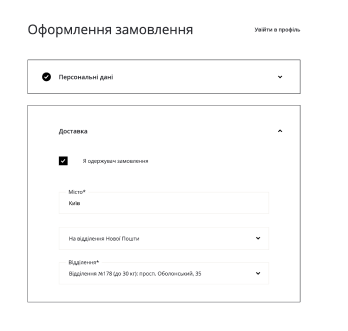
We simplified the checkout as much as possible, structured the information in the order form and divided it into semantic blocks using visual accents.
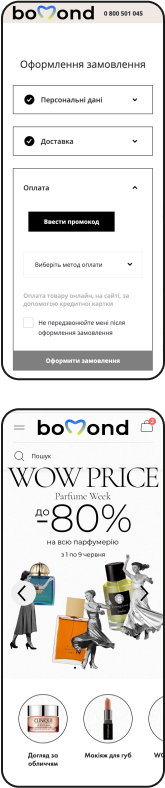
A large part of the audience buys goods from mobile phones or tablets, we develop interfaces taking this into account